Introduction
The font Wingdings is one of those quirky parts of computing history that many people remember—even if they never used it intentionally. In the first 100 words, it’s worth noting that Wingdings appears as a built-in symbol font in many versions of Windows, and its mixture of icons and symbols makes it a fascinating chapter in typography. Here we’ll explore the origins of Wingdings, how people have used it, and why it still holds cultural curiosity.
What Is Wingdings?
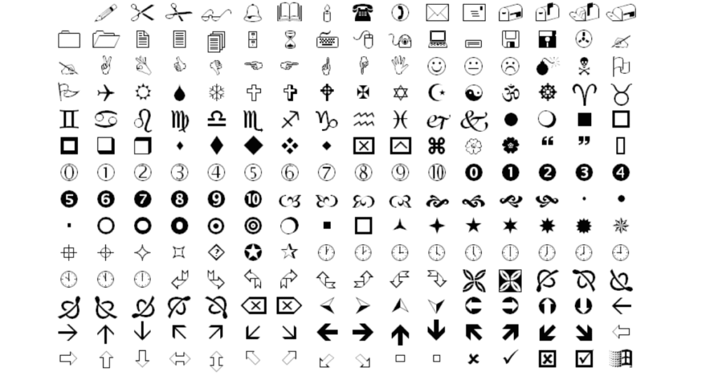
At its core, Wingdings is not a typical alphabet font. Instead of letters and numbers, it maps keyboard keys to pictograms, icons, and symbols—making it what typography experts call a “dingbat” font. It was originally released by Microsoft after acquiring designs from typographers and combining them into this unique font family.
The Origins of Wingdings
The story of Wingdings begins with the typography team of Charles Bigelow and Kris Holmes, who designed the initial set of glyphs around 1990-1991 to complement their Lucida font family. Microsoft released Wingdings in 1992, and it soon became part of Windows system fonts. The name itself is a clever mash-up: “Wing” from Windows and “dings” from dingbats.
Why Was Wingdings Created?
In the early 1990s, it was harder to embed images in documents and add icons next to text. The solution: a symbol font that functioned like images but behaved like text. Wingdings gave designers and users a quick way to include symbols—smiley faces, arrows, gear icons—without dealing with separate image files.
Versions: Wingdings, Wingdings 2 and Wingdings 3
The original Wingdings family included the first set of icons. Later, Microsoft released Wingdings 2 and Wingdings 3, which added new sets of symbols—arrows, indexed shapes, geometric elements, and more. Each version expanded the symbol library and increased the font’s flexibility for various design tasks.

How Wingdings Works in Practice
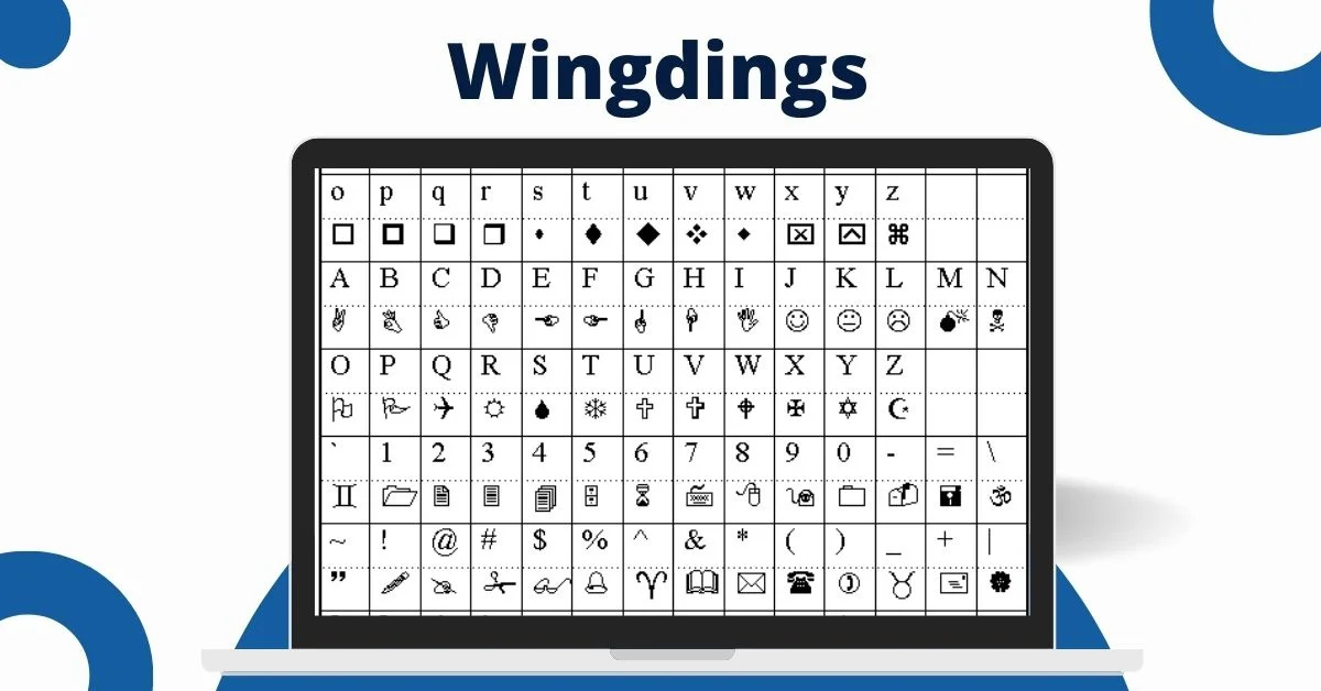
Because Wingdings maps standard letters to symbols, using it requires knowing which key corresponds to which icon. Some common uses include inserting symbol bullets in documents, replacing text with decorative icons, or creating playful typography. There are even alt-codes and character maps that show how to access specific Wingdings symbols.
Creative Uses of Wingdings
Designers and typographers have used Wingdings for many creative purposes:
- Using arrows, hands, or pointers from the font to highlight parts of a document.
- Using geometric icons as decorative bullet points or dividers.
- Using the font in print or digital designs for a retro-tech look.
In my own work, I once used the Wingdings heart and arrow symbols to create a fun styled Valentine’s card—people recognized the icons immediately even though they were just from a font.
Controversial Myths Around Wingdings
Wingdings has also been subject to conspiracy theories. One of the most well-known is that typing “NYC” in Wingdings produces a skull and crossbones, a Star of David, and a thumbs-up gesture—leading to claims of hidden antisemitic meaning. Microsoft denies any such intention and states the mapping was random. While the incident is mostly harmless folklore, it shows how people often attach meaning to symbol sets.
Wingdings and Unicode: The Transition
Originally, none of the Wingdings characters were mapped to Unicode, making them non-standard across systems. Later, many of the symbols were added into Unicode 7.0. This improved compatibility across devices and platforms so that symbols behave more consistently.
Why Wingdings Still Matters
Although newer icon fonts and emojis have largely replaced Wingdings for everyday use, the font still matters for several reasons:
- It’s part of typographic history and early digital design.
- It shows how symbols can function like fonts, blending image and text.
- It remains useful for designers looking for built-in, scalable icons without extra image assets.
Practical Tips for Using Wingdings
If you want to use Wingdings today, here are some simple tips:
- Use a character map or symbol viewer to select the icon you need rather than guessing keys.
- When using in documents or web design, ensure the font is available or embed the font to avoid mapping issues.
- Consider compatibility: since not all systems interpret Wingdings the same way, test on multiple devices.
- Use the icons sparingly and intentionally—because heavy use can confuse readers if the meaning isn’t clear.
The Future of Wingdings and Symbol Fonts
As design trends evolve, symbol fonts continue in new forms: icon fonts, SVG icons, font-based icons, and emojis. Wingdings remains a foundation for how designers thought about symbol fonts. In a world full of emojis, Wingdings is a reminder of a time when fonts bridged the gap between text and image.
FAQs
Q: Can I use Wingdings symbols as emojis on social media?
A: You can, but they may not render the same on all devices or browsers because of mapping and font availability.
Q: Why does Wingdings map letters to icons rather than letters?
A: It was designed as a dingbat font—a set of decorative symbols—rather than a standard alphabet.
Q: Is Wingdings still included in modern Windows versions?
A: Yes, the Wingdings family remains available in many Windows installations though it may be less front-and-centre than before.
Q: How do I know which Wingdings key produces which symbol?
A: You can use a character map tool or an online Wingdings translator to identify which letters map to which icons.
Conclusion
The font Wingdings may look like a quirky novelty, but behind the odd symbols lies a meaningful typographic innovation. It represents a moment when designers sought to give users image-based icons in a font format rather than separate graphics. Whether you’re a designer, a curious student of type, or someone who remembers typing odd letters and seeing strange symbols appear—Wingdings has left its mark. It reminds us that fonts aren’t just about letters—they can also carry meaning through symbol and shape. If you’re ever working on a document or design and need a quick icon, don’t forget: Wingdings is still out there, ready to add a little visual spice.


